Showing posts with label museums. Show all posts

The First Homosexuals, Kunstmuseum Basel

Friday, July 10, 2026

A few months ago, I visited beautiful Basel in Switzerland to see an exhibition at the Kunstmuseum Basel. The First Homosexuals has a provocative title, looking at art from the late 19th and early 20th centuries.

This was a time when the terms homosexual and homosexuality were coined and became popular. Of course, people in that time period were not the first people to experience same-sex desire - but they were the first homosexuals. 


The exhibition makes the point that the history of art is simultaneously a complete archive of the history of sexuality.

The accompanying booklet had 2 pages dedicated to a 'plain language' explanation and around 40 pages for academic and theoretical discussion. Sometimes I wonder (and wish) why the plain language cannot lead the way. All the academic theories in the world cannot fully comprehend the many ways queer lives are lived and people's fluid and varied sexualities.

So instead of getting bogged down in academic art-speak, I've chosen to focus here on the paintings that show early artistic depictions of queer couples.

Henrik and John

This painting depicts Hendrik Andersen (left), then aged 22, with American painter John Briggs Potter, aged 29. It's a very domestic and intimate scene, set in a house in Florence where they both lived with Hendrik's brother Andreas, who painted the painting in 1894.

Interior with Hendrik Andersen and John Briggs Potter in Florence, Andreas Andersen, Hendrik Andersen Museum, Rome via Wikimedia Commons

The Andersen brothers were born in Norway, moving to the United States as children. It's never possible to fully know, but this artwork is often described as the first publicly displayed painting of an unambiguously homosexual couple. Hendrik Andersen later met the author Henry James in 1899, and the two had a long relationship. You can read about this here.

Emilie and Marie

Emilie Mundt and Marie Luplau were an artist couple from Denmark who lived together in a home in Frederiksberg, a district of Copenhagen. This painting by Emilie dates from 1893, and shows Marie with her and Emilie’s daughter Carla as well as Marie’s father in the background. This is easily one of the earliest artistic depictions of a multigenerational queer family.

Malerinde og barn i atelieret, Emilie Mundt, Wikimedia Commons

Emilie and Marie were very involved in fighting for Danish women to have an artistic education, opening their own painting and drawing school for women. You can read more about Emilie and Marie here. 

Jacques-Émile and Rafael

This self-portrait is from 1890. It’s by French artist Jacques-Émile Blanche with Spanish artist Rafael de Ocha y Madrazo, who is understood to be his partner. Jacques-Émile Blanche was a portrait painter, largely self-taught. He worked in Paris and London and summered at his family’s country home in Dieppe.

Self-Portrait with Raphael de Ochoa, 1890, Jacques-Émile Blanche, The Cleveland Museum of Art

Louise and Sarah

This painting by French artist Louise Abbéma depicts her with her lover, the renowned actress Sarah Bernhardt. Set during a boat trip in the Bois de Boulogne, this painting was donated to the Comédie-Française, accompanied by a letter stating that it was ‘Painted by Louise Abbéma on the anniversary of their love affair’. The swans in the painting are said to be a representation of their love, as swans mate for life.

Sarah Bernhardt and Louise Abbéma on the Lake in the Bois de Bologne, Louise Abbéma, Wikimedia Commons

The First Homosexuals exhibition was excellent, a real deep exploration of the topic with many beautiful and fascinating paintings. 


This is an edition of my ace-museums newsletter, republished here on Blogger.

Top 10 Prado Portraits

Wednesday, May 29, 2013

During my visit to Madrid, I paid a visit to the Prado Museum - or the National Museu del Prado to give it its full title. The museum was filled with stunning landscapes, biblical scenes and cleverly positioned classical paintings, but I was particularly partial to the many portraits on display.

Here are my 10 favourite portraits from the Prado.

Maria Isabel of Braganza was the Spanish queen whose collection founded the basis of the Prado museum. Queen Maria Isabel had a great affection for art, but something suggests artists didn't have the same affection for her as she's been painted in a rather unflattering, miserable pose.


Maria Amalia of Saxony has a rather fabulous red frock.


This painting of Saint Dominic is lavish, with gold decoration throughout and even extending out of the picture - the frame was topped with gold Gothic cathedral spires.


This portrait of a rich, young boy seems to tell you all you need to know about the man this child will grow up to become.


This painting is of a small girl, Eugenia Martinex Vallejo. She was very over-weight and perhaps even disabled. Aged 6, she was taken to the Spanish court to be put on display, pointed at, and stared at. The poor child! Hanging near this painting is a nude portrait of the girl, which makes her seem all the more poignant.


This portrait cleverly (and a little spookily) shows the artist and his family.


On a list of favourite queens, Maria Luisa must rank high. She looks like a game lass, perched high on her horse, always up for a bit of craic.


Speaking of horses, here's the Duke of Lerma in a powerful pose and portrait. Although this really is a much better portrait of his horse, a glamorous beast.


Here's Maria Theresa, formidable Queen of Hungary and Croatia, Archduchess of Austria, Queen of Bohemia and Empress consort of the Holy Roman Empire. But this portrait shows her as a little girl, a very different image of her than we have today.


And, finally, Maria Cristina of the Two Sicilies, bearer not only of a fantastic name but also a rather fabulous hat.

Mariacristina


There are thousands more paintings and artworks in the Prado Museum, many of which can be explored on their website.


Eyewitness at the Royal Academy

Saturday, July 30, 2011

I went recently to see an exhibition of Hungarian photography at the Royal Academy. The exhibition is called Eyewitness (open until 2nd October), a very appropriate name - it shows how the history of Hungarian photography acts as a witness to many of the most significant best/worst historical moments throughout the 20th century.

Artistic trends such as Bauhaus and abstraction are reflected in the photography, as well as giving a chronicle of how photography developed from amateur photo-players to professional fashion and journalism.

Much of the photography was incredibly angular, shooting at acute and implausible angles. Whereas now we can zoom in and out of the world at the click of a button, then this must have felt revolutionary.

There were lots of photographs to enjoy, here are just some of my favourites.


This photo by Robert Capa shows a French woman who had a baby with a German soldier during World War 2 being led through the streets of Chartres. The photo below - also by Robert Capa - shows  the destruction of Budapest's Elisabeth Bridge.


The photo below - Harvest by Erno Vadas - shows the beginning of abstract patterns and shapes.


Cornell Capa's image of Winchester College shows implausible angles.


To which Lazlo Maholy-Nagy's image from Berlin's TV Tower adds abstract shapes.


Martin Munkácsi's fashion image from Harper's Bazaar


Probably my favourite image: Procession by Erno Vadas


And finally, this book cover by Gyorgy Lorinczy shows how many Hungarian photographs found an excellent subject in the skyscraper and concrete world of New York.


Sending postcards to museums

Friday, August 20, 2010

Last year, when I went to Norwich, I bought some snapshot sets at a second-hand market. I had never seen such things before: little envelopes in which were several snapshot photocards. "How novel," thought I, "I'll buy them!"


I bought sets with pictures of: Shetland, Amsterdam, Niagara Falls, San Remo, Norway and Vienna.

A year later, I have looked at and admired these sets quite enough - but what to do with them? I don't want to just throw them away (that would never do), and charity shops don't seem worthy enough - so I hit on the idea of sending them to relevant museums.

This is a bit foolhardy: museums generally have lots of things in their collections, more than enough, and possibly don't need items they have not solicited. On the other hand, I'm intrigued to see which museums might like the sets. And, so...

I'm sending the Shetland set to the Shetland Museum.


The Amsterdam set go to the Amsterdam Historical Museum.


The Norwegian Maritime Museum receive the 19 images of Norway's coast.


20 photographs of San Remo go to San Remo's Museo Civico


Beautiful photographs of Vienna go to the Wien Museum


And finally, the twelve photographs of Niagara Falls go to the Niagara Historical Museum


I'll let you know what happens.


Small Spaces @ V&A Museum

Friday, August 06, 2010

I went to the V&A Museum last week to see Small Spaces, an exhibition of seven small structures built by architects in the V&A's galleries.

It was fascinating. I love small, cosy, cute spaces so the whole idea appealed to me.

The structure I had most wanted to see was a tea-house by Terunobu Fujimori. Raised up on four spindly, tree-branch like legs, you climb a little ladder to enter the teahouse. Inside, the ceiling is covered with tiny pieces of charred wood arranged in a parallel pattern with a simple tea-set. It was utterly charming.


Architects from Mumbai built a structure based on in-between spaces in Mumbai which become home to people in the city. They live in the cracks of the city, between, say, a warehouse and a factory, covering above with a the ceiling of sheet metal and making a home.

Norwegian architects built a four-storey walk-in bookcase, made of smooth Scandinavian wood with two in-built seats covered in animal furs. I wanted to stay there all day reading. Another staircase structure had lots of nooks hidden behind curtains. Climbing it was like my own mini-drama: what would be behind each drape?

In addition to the structures, models and drawings of structures that were not made were on display. I loved an Austrian architect's structure which would have had people walking on grains, with small pools of water around them and gently swaying stalks of wheat and barely suspended from the ceiling.


I also loved a structure in which you lie face down on the floor in a dug out groove, with a small screen under your eyes which shows someone else's viewpoint as they walk around the museum. It was a real shame this was not built, I really hope it will be.


The exhibition showed how architecture affects us all, making us smile, making us unhappy, and inspiring our curiosity.

Caroline Irby's A Child from Everywhere

Monday, August 02, 2010

I went last weekend to see Caroline Irby's A Child from Everywhere at the V&A Museum of Childhood.

Juan from Chile, by Caroline Irby

In her project, photographer Caroline Irby found children from 185 of the world's countries who are now living in the UK.

Nadine from Egypt, by Caroline Irby
I'm always a fan of 'someone from every country' style projects, so I admire Caroline Irby's spirit. The resulting photographs are wonderfully expressive, capturing some of the personality of each child and their fascinating life stories.

14 of these photographs are on display at the V&A until the end of August, accompanied with films and short interviews with some of the children.

Happily, the films, made for Channel 4 can be seen online here, and all the photographs, taken for The Guardian, can be seen here. Additionally, these articles on the project from The Times and Junior magazine make interesting reading.

Chinese art at the Ashmolean Museum

Monday, July 26, 2010

On Friday, I went to Oxford for the first time, spending some time at the Ashmolean Museum. The Museum's vast collection of objects is shown off wonderfully by the new extension to the building which brings light, brightness and freshness into the Museum's space. It also has some lovely undulating staircases.

Museums are usually vast: vast spaces - so many objects, so much to see, explore, learn. I'm always drawn to small, discrete spaces. At the Ashmolean, my favourite gallery was the Khoan and Michael Sullivan Gallery of Chinese Paintings, a lovely wood-lined, split level gallery showing Chinese painting and art through time and artefacts relating to painting, calligraphy and illustration.

The first 'painting' I saw wasn't actually a painting, but a papercut by Bovey Lee. I love the delicacy, intricacy and sheer attention to detail in these papercuts.


The calligraphy and implements on display were equally beautiful, fascinating and ornate. Imagine all the images made by these tools through time. All the images below come from the Ashmolean's online collections website Eastern Art Online.

Porcelain brush rest
This Chinese porcelain brush rest (something I never knew existed, but a very handy invention) dates from either the 2nd half of the 16th century or the first half of the 17th century.

Brass seal
This seal stamps calligraphy design, and dates from 1749.

Calligraphy
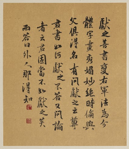
And this calligraphy, while pretty recent (dating from 1990), tells the story of artisan Wang Xianzhi's response to his new-found fame.

Look at all the Ashmolean's calligraphy objects.

Photographers Gallery

Monday, June 15, 2009

I recently submitted some images to the Photographers Gallery in London - not in any professional sense, but for a fun online gallery called Beautiful Disasters, which encourages anyone to upload images they have taken which went wrong, but have something beautiful about them.

I uploaded these two. The first is a building somewhere in the City seen, I think, from Bethnal Green road (or somewhere Hackney / Shoreditch) on a bright February afternoon. The photo came out blurry, but I really like the feeling of this being a balmy high-summer day, and the light reflecting on the building in the foreground.

City skyscraper

The second shows blurred street lights in Cork city, around dusk. It wasn't as dark as the photo implies, but I love the effect of the sky and the light trails.

Blurred street lights, Cork

The gallery is now closed for uploads, but there are many interesting photos to look through.

I also noticed on their site a project called the The World in One City. It aims to take portraits of citizens living in London from all 205 world nations, to be displayed in time for the 2012 Olympics. Fantastic.

Tree @ Natural History Museum

Thursday, March 26, 2009


Tree is the short and succinct name for a new permanent installation at the Natural History Museum.

Erected to commemorate 200 years since Charles Darwin's birth, and installed in the ceiling of a gallery, tree takes its concept from the Darwin's tree of life. It's a wooden, cross-section of a 200 year old oak tree with branches stretching across the gallery's ceiling.

Most impressively, at over 17 metres long, Tree will be the Natural History Museum's largest botany specimen on display.

I was impressed by the way the artist Tania Kovats managed to mix her artistic touch with the Museum's scientific endeavour. I liked how as I looked at the tree, I started to consider the science and its 'natural history'.

Olympic posters at the V&A museum

Monday, August 18, 2008

The V&A Museum of Childhood currently have an exhibition of A Century of Olympic Posters (until Sept 7).

For me, the posters that work best are those that use Olympic symbols, and mix them with sporting icons, and add visual elements of the host nation or city.

There was a definite trend - earlier posters were quite illustrative, realistic and detailed, with the lines becoming clearer and more minimal as time went on.


My three favourites were:


Mexico 1968 Olympic poster: Starting with Mexico 68, this adds more parallel lines to give the impression of race track lines and Mayan designs. Overall, an eye-catching and dynamic poster, and very in keeping with the symmetrical OpArt trends of the 60s.


Moscow 1980 Olympics poster: Another simple design but one which is really effective: the lines look like track lines and are a visual link to the Kremlin's architecture.


Montreal 1976 Olympic poster: again, this uses a simple design but really gives an impression of movement which is so part of the Olympics and sport.
London's 2012 logo was featured in the exhibition, and I have to say that, of recent efforts, I think it is the best (certainly beating Beijing and Athens), but doesn't seem to have any element of sport in it which is a shame.

A French poster also caught my eye . If you think the sporno trend of homoerotic sportsman is new - check out these boys from the 1924 Paris Olympics.

Want to be in a Kylie video?

Friday, January 12, 2007

Volume

Volume, at the V&A museum, is ace. The installation is a collection of 40 or so upright poles covered in tiny lights, which respond to movement and sound, changing colour and style. I wasn't sure how the whole interactive part worked, but they certainly look pretty. With the swooshing colours and twinkling disco lights, it's just like being in a Kylie video.

Some other bits + bobs:

* Russian pop-hunk Dima Bilan is playing at the Russian Winter Festival in Trafalgar Square, tomorrow, 2.30pm. Ace!

* AceDiscoVery favourites Dragonette are gigging next Thursday, at Metro, central London, 11pm. Expect ace synthy-pop purveyed whilst wearing something fabulously trashy.

* I'm going to Finland in 2 weeks on a random Euro-jaunt, visiting Tampere and Helsinki. Any recommendations of things to do, places to visit, music to buy will be gratefully received.

* Prison Break is back on Channel 5 next Monday. Hurrah, phwoar, etc.

* There's a song in the Spanish eurovision preselection called Me gusta hacer canciones con un hey (I like to sing songs with a 'hey'). Ace title, but sadly it's pretty rubbish.